Showing posts with label pics. Show all posts

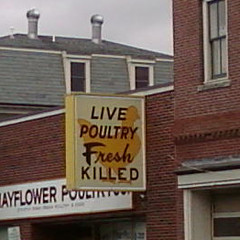
Live Poultry Fresh Killed

Thursday, July 16, 2009

So a while back I was wandering around Boston, and saw this little gem of a sign. I couldn't help but snap a phone-cam shot of it. I thought I'd have a wacky photo to share with the world.

Little did I know that I was hardly the first person to snicker at this particular sign. How unoriginal.

The shop, Mayflower Poultry, apparently does sell chickens that are slaughtered on-site daily. They also sell a variety of merchandise emblazoned with the (ostensibly) famous graphic.

Call me old-fashioned, but I can't help but find the live poultry, fresh killed thong underwear more than a little disturbing.

Architectural Madness

Friday, June 5, 2009
I recently visited the Stata Center at MIT in Boston, and took these photos. The building resembles a crazily-assembled hodgepodge of textures and geometric shapes: it looks altogether unlike any other building anywhere; as though it was a human building designed by martians with only a general description of what our buildings looked like.

The effect for a casual observer is breathtaking: the building is a bizarre and visually satisfying amalgam (perhaps mishmash is a better term) of colors and textures, weirdly canted angles and shapes that appear jammed together at random.

The building was designed by Frank Gehry, who also designed other wacky architectural masterpieces-slash-modernist-nightmares, including Disney Hall in Los Angeles, and the Experience Music Project in Seattle.

Unfortunately, it appears that the functionality of the building is far less impressive than its visual appeal. There is no understandable layout to the building, and (to an unfamiliar observer, of course), it appears ridiculously easy to get lost in.

Floor-to-ceiling glass walls in some offices means that privacy is impossible. The otherworldly angles, while striking, make hanging bookshelves well-nigh impossible.

The Wikipedia article on the Stata Center lists other defects, including a lack of soundproofing, a tendency to induce vertigo in its inhabitants, and a giant-sized price tag.

Oh, and it's probably not a good sign that MIT is suing Gehry, for massive design flaws leading to cracked masonry, flooding, and mold.

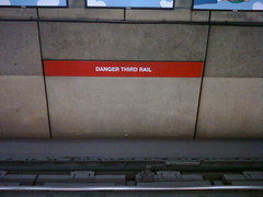
The Third Rail

Thursday, June 4, 2009

I saw this sign while I was out and about. While I'm generally a fan of obtuse signage, this one seemed a bit odd. Now I now what a third rail is, but for someone not acquainted with subway electrical terminology, this sign lacks the proper amount of actual warning to be useful. And of course it misses the opportunity to use a hilarious illustration of a stick figure being electrocuted.

This is all prelude (as ever) to a reference to a bizarrely comprehensive wikipedia page: Third Rail. Seriously, is there that much to write about direct current? Ah, who am I kidding? I love it.

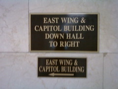
Who thought this made sense?

Monday, June 1, 2009

Seen recently while I was out. Seriously, did someone put one (or
both) of these signs up together and think "Yeah, this makes sense.
Nobody will have any problem with this"
? At least they didn't use
quotations marks for "emphasis." Then my head might have exploded.


Pseudonym: It makes a weird sort of sense, I think, down THIS way then to the right, vs. Down to the right, this way. Do I think the signage is dumb, yes, but you can see just what happened: Some clown put up a sign that is extremely clear (but completely inaccurate) and some Deputy Clown tried to fix it by addendum. The 2nd sign makes the whole situation just the opposite, accurate, but very unclear.

Even without the written hints, I could guess this was a governmental building.